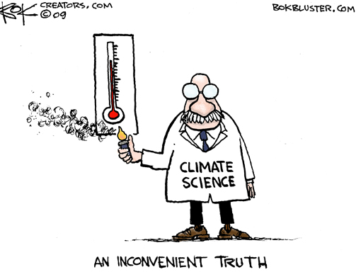
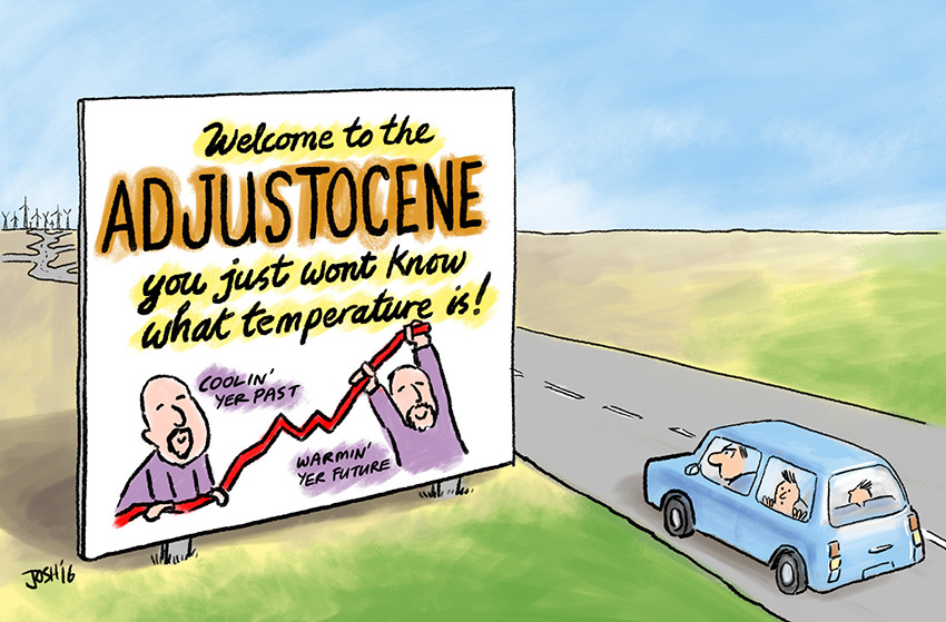
3.5.11 Manipulationen
en Manipulations
fr Manipulations
| ⇧ Probleme / Problems / Problèmes | |||||
| ⇨ | Klimaschwindel | Klima-Panik | UNEP/UNFCCC | IPCC/GIEC | Fehler I |
|---|---|---|---|---|---|
| Fehler II | Kritik | Klima-Modelle | Prognosen | Manipulation | |
| ⇨ | Klima: Wandel│ Fragen│ Wissenschaft│ Probleme│ Beurteilung│ Diskurse│ Auswirkungen | |||
| ⇩ | Klima-Skandal: Manipulation│ Realität│ Angst | |||
| ⇩ | Neue Kälteperiode: Kaltzeit│ Auswirkung | |||
Mit folgenden Links wird von anderen Webseiten auf diese Seite verwiesen:
| de | en | fr |
|---|---|---|
|
Klimawandel: Probleme Temperatur-Manipulationen Skandal Manipulationen Teil I, II, III Climategate Institute, Who's who, Mails |
Climate change: Problems Temperature Manipulations Scandal Manipulations Part I, II, III Climategate Institutes, Who's who, Mails |
Climat: Problèmes Manipulation des températures Scandale Manipulations partie I, II, III Climategate Instituts, Qui est qui, Méls |
Links zur Klimaschau
|
|
Temperatur‑Manipulationen:
▶Probleme,
▶Wissenschaft
Wissenschaft: ▶Gefälschte Temperaturdaten Wissenschaft: ▶Nachträgliche Temperatur‑Manipulationen Wissenschaft: ▶Temperaturmessungen durch Satelliten Manifestationen: ▶Temperaturen Klima-Skandal: ▶Manipulationen |
- a de
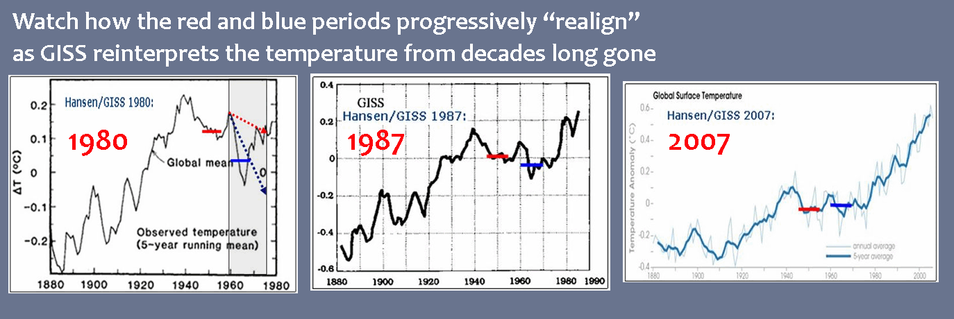
Die GISS-Daten werden nachträglich verändert
en USHCN and GISS decided to "adjust" the temperature record - b de
Gitterpunktsabstand
en Smoothing Radius - c de
NOAA hat alle ausser 1,500 von 6,000 Thermometern gelöscht
en NOAA had deleted all but 1,500 of the 6,000 thermometers - d en Black Swan Climate Theory
- e de
NOAA in Not: Erwärmungspause der letzten 15 Jahre lässt sich nicht
so einfach wegtricksen
en NOAA erases 'pause' in warming - f de
NASA/GISS Hansen: Drei Jahrzente Temperaturdaten-Anpassung
en NASA/GISS Hansen: Three decades of Temperature Adjustments - g de
1940 wärmer als 1998? - Ja!
en 1940 warmer than 1998? - Yes!
fr 1940 plus chaud que 1998? - Oui! - h en UK Met Office Hadley Centre / Professor Phil Jones
- i de
Das Hockeyschläger Diagramm
en The Hockey stick curve
fr La courbe en crosse de hockey - j de
Als das IPCC das Mittelalterliche Klimaoptimum verschwinden ließ
en IPCC changed viewpoint on the MWP in 2001
fr Comme le GIEC avait disparu le Optimum médiéval climatique
de Verzeichnis en Contents fr Sommaire
- de Allgemein en General fr Générale
- 2018
- de
NOAA-Datenmanipulation um 1,4°C:
"Schlimmer kann Wissenschaft nicht degenerieren"
en NOAA 2.5 Degrees F Data Tampering - 'Science Doesn't Get Any Worse Than This' - 2017
- de Temperaturdatenmanipulation von GISS (NASA) erneut nachgewiesen
- en Robust Evidence NOAA Temperature Data Hopelessly Corrupted By Warming Bias, Manipulation
- 2015
- de
NOAA in Not: Erwärmungspause der letzten 15 Jahre lässt sich nicht
so einfach wegtricksen
en NOAA erases 'pause' in warming - en Black Swan Climate Theory
- de
NOAA versteckt die Rohdaten hinter einem Viertel-Millionen-Dollar
Schutzwall
en NOAA demands $262,000 fee for looking at their 'public' data - 2011
- de
Wärmegehalt der Ozeane ist geringer als bisher gedacht
en Ocean Heat Content Adjustments: Follow-up and More Missing Heat
de Text en Text fr Texte
⇧ de Allgemein en General fr Générale
|
|
|


![]()
![]()
| de | en | fr |
|---|---|---|
|
Klimawandel: Probleme Temperatur-Manipulationen Skandal Manipulationen Teil I, II, III Climategate Institute, Who's who, Mails |
Climate change: Problems Temperature Manipulations Scandal Manipulations Part I, II, III Climategate Institutes, Who's who, Mails |
Climat: Problèmes Manipulation des températures Scandale Manipulations partie I, II, III Climategate Instituts, Qui est qui, Méls |
| NOAA |
National Oceanic and Atmospheric Administration
▶NOAA: Who is who (Institute & Organisationen der Globalen Erwärmung)
Manipulationen |
| NASA/GISS |
NASA National Aeronautics and Space Administration GISS Goddard Institute for Space Studies ▶NASA/GISS: Who is who (Institute & Organisationen der Globalen Erwärmung)
Manipulationen |
↑
a Die GISS-Daten werden nachträglich verändert
en
USHCN and GISS decided to "adjust" the temperature record
-
Real Science
2016-01-15 en "If the facts don't fit the theory, change the facts."
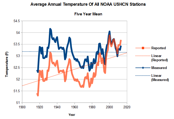
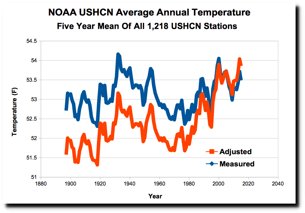
 NASA US temperature data is based on NOAA USHCN data, which is
massively altered to create the appearance of warming.
NASA US temperature data is based on NOAA USHCN data, which is
massively altered to create the appearance of warming.
 The graph below shows how the NOAA data is altered.
The blue line shows the averaged measured temperature at all USHCN stations, and the red line shows the average adjusted temperature.The warming trend over the last century is entirely due to "adjustments" by NOAA.
Note how the "1940s blip" has been largely removed.
|
|
|
|
|
de
(a) = Ursprüngliche Angabe
en
(a) = Original indication |

|
|
|
|
|
|
|
|
|
|
|
|


|
|
en
GISS 1999 vs 2008 Data interpretation |
↑
b Gitterpunktsabstand
en
Smoothing Radius
|
de Die erste Graphik zeigt die Anomalien im Juni 2010, vom GISS interpoliert aus einem Gitterpunktsabstand von 1200 km Die grüne Linie markiert den 80. Breitengrad Nord. Man erkennt, dass die Darstellung von GISS im Wesentlichen in der Region nördlich von 80° eine Temperaturabweichung bis +4 K zeigt. en GISS June 2010 anomalies smoothed to 1200 km. The green line marks 80N latitude. Note that GISS shows essentially the entire region north of 80N up to four degrees above normal. |
de Diese Graphik zeigt das Gleiche, jedoch mit einem Abstand der Gitterpunkte von 250 km. Wie man sieht, hat das GISS nur sehr wenige oder gar keine Daten nördlich von 80° N. en This map is the same, but with 250 km smoothing. As you can see, GISS has little or no data north of 80N. |
|
|
|
|
de James Hansen (NASA/GISS): ... die über 12 Monate gleitende mittlere globale Temperatur hat in den Analysen des GISS im Jahre 2010 einen neuen Rekord erreicht... Die GISS-Analysen weisen das Jahr 2005 als das wärmste Kalenderjahr aus, während die Analyse vom HadCRUT 1998 als das wärmste Jahr zeigen. Hauptursache [für diese Diskrepanz] ist, dass wir die geschätzte Temperatur der Arktis mit einbezogen haben. Mit anderen Worten die Daten vom GISS basieren auf inkorrekten, konstruierten Daten. Warum hat es Hansen offensichtlich gefallen, die gemessenen Daten des DMI zu ignorieren und stattdessen auf "geschätzte" Daten aus der Arktis zurückzugreifen? Die Temperaturanomalien in der Arktis sind nach GISS bis zu 4 K zu hoch, und doch behauptet er, einen gemessenen Rekord um ein paar Hundertstel Grad zu haben. |
en James Hansen (NASA/GISS): ... the 12-month running mean global temperature in the GISS analysis has reached a new record in 2010... GISS analysis yields 2005 as the warmest calendar year, while the HadCRUT analysis has 1998 as the warmest year. The main factor is our inclusion of estimated temperature change for the Arctic region. In other words the GISS record high is based on incorrect, fabricated data. Why did Hansen apparently choose to ignore the DMI data when "estimating" Arctic temperatures? GISS Arctic anomalies are high by as much as 4 degrees, and yet he claims a global record measured in hundredths of a degree. |


↑
c NOAA hat alle ausser 1,500 von 6,000 Thermometern gelöscht
en
NOAA had deleted all but 1,500 of the 6,000 thermometers
|
|
|
|
|
|

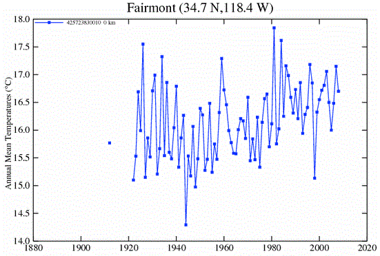
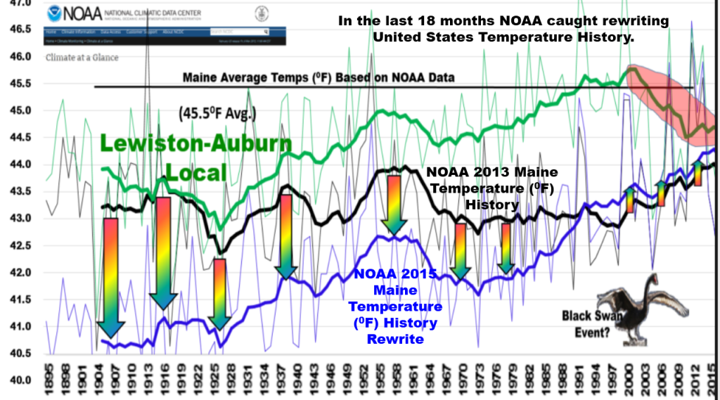
↑ d en Black Swan Climate Theory
In this five part video series, Engineering Physicist Michael W. Brakey discusses the corrupt data being provided by the National Oceanic and Atmospheric Association in order to promote the theory of Global Warming.
![]()
![]() "Get Out Of Adjusting Business !
"Get Out Of Adjusting Business !
Grün/Green (local source): Lewiston-Auburn area of Maine
Schwarz/Black (NOAA 2013): Maine's overall state
Blau/Blue (NOAA 2014)
(3° Fahrenheit ≅ 1,5° Celsius)
-
EIKE Europäisches Institut fü Klima und Energie
2015-05-12 de Black Swan Climate Theory
-
NoTricksZone (Pierre L. Gosselin)
2015-05-09 en Energy Physicist Implores NOAA To Return To Credibility "Get Out Of Adjusting Business !
-
NoTricksZone (Pierre L. Gosselin)
2015-06-01 en Bombshell: Comprehensive Analysis Reveals NOAA Wrongfully Applying "Master Algorithm" To Whitewash Temperature History
-
NoTricksZone (Pierre L. Gosselin)
2015-07-07 en NOAA's Data Debacle ... Alterations Ruin 120 Years Of Painstakingly Collected Weather Data (Part 2/2)
↑
e NOAA in Not: Erwärmungspause der letzten 15 Jahre lässt sich nicht
so einfach wegtricksen
en NOAA erases 'pause' in warming
2015: NOAA Data Tampering Since Last Year
|
|
|

-
Die kalte Sonne (Fritz Vahrenholt & Sebastian Lüning)
2015-12-09 de IPCC-Autor Gerald Meehl verurteilt fragwürdige Rettungsaktionen von Klimaaktivisten zur Erwärmungspause: Der Hiatus ist real und ist erklärungsbedürftig2015-07-02 de NOAA in Not: Erwärmungspause der letzten 15 Jahre lässt sich nicht so einfach wegtricksen
2015-06-15 de Max Planck Gesellschaft: "Die Temperaturen stagnieren ungefähr seit 1998, wenn auch auf hohem Niveau"
-
Watts Up With That? (Antony Watts)
2015-06-09 en Climate scientists criticize government paper (Karl et al. 2015) that erases 'pause' in warmingUntil last week, government data on climate change indicated that the Earth has warmed over the last century, but that the warming slowed dramatically and even stopped at points over the last 17 years.
National Oceanic and Atmospheric Administration has readjusted the data
But a paper released May 28 by researchers at the National Oceanic and Atmospheric Administration has readjusted the data in a way that makes the reduction in warming disappear, indicating a steady increase in temperature instead.
But the study's readjusted data conflict with many other climate measurements, including data taken by satellites, and some climate scientists aren't buying the new claim.
"While I'm sure this latest analysis from NOAA will be regarded as politically useful for the Obama administration, I don't regard it as a particularly useful contribution to our scientific understanding of what is going on," Judith Curry, a climate science professor at Georgia Tech, wrote in a response to the study.
"The new NOAA dataset disagrees with a UK dataset, which is generally regarded as the gold standard for global sea surface temperature datasets," she said.
"The new dataset also disagrees with ARGO buoys and satellite analyses."
-
EIKE Europäisches Institut für Klima und Energie
2016-01-24 de Die "Karlisierung" der Temperatur der Erde
-
Watts Up With That? (Antony Watts)
2016-01-21 en The 'Karlization' of Earth's Temperature
-
Gerald A. Meehl, National Center for Atmospheric Research
2015 en Decadal climate variability and the early-2000s hiatus
-
Die kalte Sonne (Fritz Vahrenholt & Sebastian Lüning)
Frank Bosse und Fritz Vahrenholt
2016-02-09 de Die Sonne im Januar 2016, Rekorde und Ozeanströmungen: Der Golfstrom bleibt stabil!Das Rekordjahr 2015 und was dazu beitrug
Das Jahr 2015 endete mit einem Rekordwert: Die Temperaturreihe GISS verzeichnete +0,87 °C Anomalie gegenüber dem Referenzzeitraum 1951-1981.
Dies waren nochmals 0,13°C mehr als im Vorjahr 2014 global festgestellt wurde. Besonders stark stiegen die Ozeantemperaturen an.
Ein Blick zurück auf einen nur wenige Monate älteren Datensatz GISS vom Mai 2015 zeigt, dass die globalen Mitteltemperaturen 2014 damals noch um 0,06°C geringer angezeigt wurden als im Januar 2016.
Wie kann das sein? Im Sommer 2015 wurde eine Korrektur der Meerestemperaturen eingeführt, wir hatten u.a. hier darüber berichtet.
Der Auslöser:
Die Messmethoden zur Erfassung der Oberflächentemperaturen der Meere (SST- Sea Surface Temperature) änderten sich ab 1998.Wurden früher die SST von Schiffen aus bestimmt, oft indem die Wassertemperatur in Eimern oder über das angesaugte Kühlwasser gemessen wurde, ging man später zu präziseren Bojenmessungen über.
Dieser Übergang trug, so die Wissenschaftler um T. Karl von der NOAA, eine negative Verfälschung ein, die man mit Korrekturen (für die offensichtlich zu warmen Messungen der Vergangenheit nach unten, für die präzisen Messungen der Gegenwart nach oben) minimierte.
Diese Maßnahme wurde sehr schnell für die globalen Bodentemperatur-Reihen übernommen.
Es gibt hierfür nicht nur Beifall in der Fachwelt, wie unser Artikel "IPCC-Autor Gerald Meehl verurteilt fragwürdige Rettungsaktionen von Klimaaktivisten zur Erwärmungspause: Der Hiatus ist real und ist erklärungsbedürftig" zeigte.
Es erscheint recht fragwürdig, gute neuere Bojenmessungen nach oben zu verändern, um sie an die schlechten alten Eimermessungen anzupassen.
...
 NOAA in Not: Erwärmungspause der letzten 15 Jahre lässt sich nicht so
einfach wegtricksen
NOAA in Not: Erwärmungspause der letzten 15 Jahre lässt sich nicht so
einfach wegtricksen
Update: University of Alabama in Huntsville (UAH) lehnt fragwürdige Veränderungen am RSS-Satelliten-Temperaturdatensatz abEinfluss des El Nino
Einen deutlich höheren Einfluss auf die weltweiten Temperaturen sehen Sie in Abb. 4 im äquatorialen Pazifik: den bereits im November 2015 voll entwickelten ElNino.
Über die Entstehung und den Verlauf dieser internen Variabilität unseres Klimas hatten wir hier berichtet.
Bereits im Jahre 2014 kündigte er sich an, zumindest bis zum Mai.
Ab Anfang August 2014 war er abgesagt, wie wir hier meldeten.
Nun also kam er mit einiger Wucht in 2015 und bescherte den globalen Temperaturen im Jahr 2015 im Mittel einen Anstieg von ca. 0,09 °C.
Das viele rot in Abb. 4 hinterließ seine Spuren in den Troposphären-und Bodentemperaturen.
Alle genannten Beiträge zum Rekord in Summe belaufen sich auf ca. 0,16°C. Nach GISS hätten wir dann etwa die globalen Temperaturen des Vorjahres.
Der Rekord in 2015 ist also zu ganz großen Teilen auf natürliche Variabilität
und eine umstrittene Korrektur von Messdaten größtenteils der Vergangenheit zurückzuführen,
die die Trends ansteigen ließ, gewissermaßen "on top" auf die klimatische Entwicklung.
Im Übrigen zeigen die Satellitenmessungen der Troposphäre keinen Rekordanstieg : beide Messreihen, sowohl UAH als auch RSS, geben 2015 nur als drittwärmstes Jahr seit 1979 an.
Dass die Troposphärentemperaturen langsamer steigen als die Bodentemperaturen ist ein Sachverhalt, den die Klimamodelle nicht reproduzieren. Sie erwarten es genau anders herum.
...
Was erwarten wir von 2016?
Zunächst werden die Temperaturen weiter hoch bleiben.
Die Wärme des ElNino ist noch vorhanden: Sie schlägt sich in verstärkter Wolkenbildung im Ostpazifik nieder. Diese latente Wärme wird erst später in den Weltraum abgestrahlt.
Der ganze Vorgang sollte noch etwa 4-5 Monate dauern,
dann werden die globalen Temperaturen sinken.
Es kündigt sich dann nämlich eine LaNina an. Dies ist nicht etwa das Gegenteil eines ElNino mit seiner Strömungsumkehr.
Vielmehr sind es "verstärkte Normalbedingungen".
Die Passatwinde wehen heftiger als normal und fördern sehr viel kühles Tiefenwasser vor Südamerika an die Oberfläche.
Dadurch wird ein Teil des erwärmten Wassers eines ElNino wieder in die Tiefe vor Indonesien verfrachtet und in die Oberflächentemperaturen geht eine große Kaltwasserfläche im äquatorialen Teil des Pazifiks ein.
In die globalen Temperaturen wird dieser doch recht heftige Umschwung sehr wahrscheinlich erst in 2017 voll durchschlagen.
Für klimatische Einschätzungen wird es so auch in 2017 noch zu früh sein, denn erst nach der zu erwartenden LaNina wird sich ein "neutrales Niveau" einstellen.
Wo das liegt ist noch unbestimmt.
Entwarnung im Atlantik
Erinnern Sie sich noch an die medial so "ausführlich" ausgeschlachteten Meldungen vom Frühjahr 2015, dass sich der Golfstrom dramatisch abgeschwächt hat durch das Schmelzen des Grönlandeises?
Wir hatten uns hier sehr kritisch mit einer Arbeit (Rahmstorf 2015) von Stefan Rahmstorf vom PIK und Kollegen auseinandergesetzt, die den neuerlichen Hype auslöste.
Die Süddeutsche Zeitung beispielsweise vermied das Wort "Katastrophe", zitierte jedoch die Autoren, die ihrer Besorgnis Ausdruck verliehen, dass stark reduzierte Atlantikströme "massive Folgen" für Mensch und Umwelt haben, ergänzten die Forscher.
Die Ökosysteme in den Meeren könnten gestört werden, was die Fischerei und die Lebensgrundlage vieler Menschen entlang der Küsten treffe.
Auch trügen Veränderungen zu einem regionalen Meeresspiegelanstieg etwa in den US-Städten New York und Boston bei.
Zudem seien auch Wetterveränderungen sowohl in Nordamerika als auch in Europa denkbar."
Im Januar 2015 erschien nun eine Arbeit von Parker & Ollier, die die Schlüsse von Rahmstorf2015 entschieden zurückweist.
Wie wir in unserem Artikel damals schon zeigten hatte Rahmstorf 2015 einen Stellvertreter ("Proxy") für die Stärke der AMOC (Atlantic Meridional Overturning Circulation, der Wärmetransport nach Norden) verwendet, der bei näherer Betrachtung offensichtlich Schwierigkeiten mit der Kausalität hatte: er reagierte auf AMOC- Veränderungen bevor diese eintraten.
Die Autoren der widerlegenden Arbeit um Albert Parker von der James Cook- Universität in Townsville, Australien verwendeten einen vertrauenserweckenden Parameter, der auch kürzere Schwankungen der AMOC gut abbildet.
-
EIKE Europäisches Institut für Klima und Energie
Klaus-Eckart Puls
2016-02-17 de Klima-Fakten 2015/16Das Jahr 2015 wurde von den Klima-Alarmisten in bewährtem engen Schulterschluß mit den deutschen(!) Medien zum "wärmsten Jahr aller Zeiten" und zum "endgültigen Klimasignal" hoch gejubelt. Jedoch - die Nachprüfung zeigt:
Es war ein so genannter "Super-El-Nino",
der die Temperatur trieb - wie zuletzt 1998. Eine nahezu verzweifelte Aktion, um nach 18 Jahren der Temperatur-Stagnation eine angeblich anthropogen verursachte Klima-Katastrophen-Hypothese zu retten, anhand eines einzigen Jahres.
Alle anderen Parameter machen auch nicht mit:
Weder die Stürme, noch die Sturmfluten, noch der Meeres-Anstieg!
EIKE Europäisches Institut für Klima und Energie
Quang M. Nguyen, P.E.
2016-02-16 de Wärmer, noch wärmer, am wärmsten - NOAA und NASA erwischt mit der Manipulation der AufzeichnungenFAZIT
Wie so häufig von den Mainstream-Medien seit April 2015 wiederholt, erklärten NOAA und NASA offiziell, dass 2015 heißer als 2014 war, das alte wärmste Jahr der Aufzeichnungen und "versprechen", dass 2016 heißer als 2015 sein könnte!
Jedoch, unleugbare Beweise zeigen, dass die von NOAA und der NASA berechneten durchschnittlichen globalen Temperaturen ungenau, unzuverlässig und nicht mit den Satellitendaten konsistent erscheinen.
1997 war das heißeste Jahr
Laut Daten der NOAA Website, war 1997 wirklich das heißeste Jahr der Aufzeichnung mit 16,9°C (62.45°F).
Die globale Durchschnittstemperatur im Jahr 2015 betrug 14,8°C (58.62°F) oder 2,12K (3.83F) von unter der Temperatur 1997. [... und unter der "Normal" Temperatur von 15°C gemäß PIK u.ä., der Übersetzer]
Nach den Daten der NOAA Website, haben die Parameter wie beispielsweise die Durchschnittstemperatur des 20. Jahrhunderts und der jährlichen Temperaturanomalien, die konstant sein müssten, unterschiedliche Werte in den jährlichen globalen Analysen.
Korrigierte historische Temperaturdaten
NOAA und NASA korrigierten historische Temperaturdaten und stellten Temperaturdaten in Gebieten ohne Temperaturaufzeichnung systematisch her, weit verbreitet und unidirektional zum "kühlen" der Vergangenheit, in dem Versuch, einen steigenden Temperaturtrend zu beweisen.
NOAA und NASAm diskreditieren ihre eigenen Satellitendaten.
NOAA und der NASA haben Anstrengungen unternommen, um ihre eigenen Satellitendaten zu diskreditieren - die im Einklang mit dem Ballon Daten sind - weil eine globale Erwärmung Pause seit 1998 im Widerspruch mit der von NOAA und der NASA bevorzugten Behauptung steht.
NOAA und NASA weigern sich die angeforderten Daten heraus zugeben
NOAA und NASA haben sich geweigert, die durch das US-Repräsentantenhaus für Wissenschaft, Weltraum und Technologie angeforderten Daten und Informationen heraus zugeben.
Es gibt keinen Grund für sie die Daten und Informationen, die öffentlich zugänglich sind, zurückzuhalten, es sei denn, sie haben etwas zu verbergen.
↑
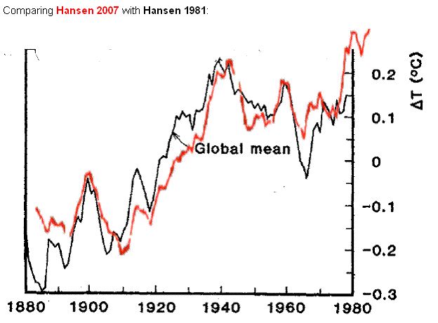
f NASA/GISS Hansen: Drei Jahrzente Datenanpassung
en
NASA/GISS Hansen: Three decades of Temperature Adjustments
|
|
|
|
with 2010 almost 0.1°C warmer than the actual warmest year of 1998. |
and 2010 about 0.1°C cooler than the warmest year 1998. |
|
|
|


↑
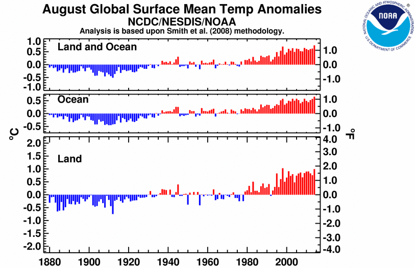
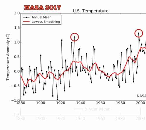
g Wie wird die Abkühlung versteckt: 1940 Spitze löschen!
1940 wärmer als 1998 ? - Ja !
en
How To Hide Global Cooling: Delete The "1940's Blip"
1940 warmer than 1998 ? - Yes !
fr
Comment cacher le refroidissement: Effacer la pointe 1940!
1940 plus chaud que 1998 ? - Oui !
Mit folgenden Links wird von anderen Webseiten auf diese Seite verwiesen:
| de | en | fr |
|---|---|---|
|
Klima Probleme: Fehler I Temperatur-Manipulationen 1940 wärmer als 1998? - Ja ! |
Climate problems: Errors I Temperatur-Manipulationen 1940 warmer than 1998? - Yes ! |
Problèmes: Erreurs I Temperatur-Manipulationen 1940 plus chaud que 1998? - Oui ! |
- en How To Hide Global Cooling: Delete The "1940's Blip"
- de
Steigen die Arktis-Temperaturen wirklich auf ein Rekordhoch?
en Comments on "Arctic air temperatures climb to record levels - en ETH Zurich: Swiss Glaciers melted in the 1940's faster than today"
↑ en How To Hide Global Cooling: Delete The "1940's Blip"
|
A: Delete The "1940's Blip"
|
B: Warming Contradicted by Satellite Records
|
|
Look at the 1940's blip here, it is nothing. Was it really this low, or did the CRU con men use statistics to cool it way down, only to have to put the 'raw' data back into the later decades to make the temperature appear higher now than in the 1940's and 1950's? |
|
|
|
en Well, thanks to the CRU data dump we have some of their temp runs from 2008 and 2005. Let's look at the CRU Land Temp Data from some selected countries around the globe (and yes, I cherry picked them, but it was not hard since all countries nearby these saw similar patterns). |

-
The Strata-Sphere
2009-11-24 en How To Hide Global Cooling: Delete The "1940's Blip"
As I and others dive into the CRU data dump we learn more and more about how the Global Warming conspiracy was pulled off. We now know all you need to do to pull this off is statistically cover up true data that tells the wrong story with 'bad' data that tells the story you want to have told.
2009-12-03 en Climategate Escalating, Smoking Gun Could Be 1940's 'Blip'
-
E-mail
2009-09-27 en From: Tom Wigley To: Phil Jonesen If you look at the attached plot you will see that the land also shows the 1940s blip (as I'm sure you know).
So, if we could reduce the ocean blip by, say, 0.15 degC, then this would be significant for the global mean -- but we'd still have to explain the land blip.
I've chosen 0.15 here deliberately.This still leaves an ocean blip, and i think one needs to have some form of ocean blip to explain the land blip (via either some common forcing, or ocean forcing land, or vice versa, or all of these). When you look at other blips, the land blips are 1.5 to 2 times (roughly) the ocean blips -- higher sensitivity plus thermal inertia effects. My 0.15 adjustment leaves things consistent with this, so you can see where I am coming from.
Removing ENSO does not affect this.It would be good to remove at least part of the 1940s blip, but we are still left with "why the blip".
fr Quelques spéculations sur comment corriger les mesures des températures de surface des océans (SST) afin d'expliquer en partie la petite hausse des températures dans les années 1940.
Si tu regardes le graphique joint, tu remarqueras que les continents ont également connu cette petite anomalie des années 1940 (comme tu le sais sûrement).
Donc, si nous pouvions réduire l'anomalie océanique par, disons, 0,15° C, cela aurait alors un impact important sur la moyenne planétaire -- mais il faudrait toujours expliquer la petite anomalie continentale.
J'ai choisi 0,15 à dessein.Il restera toujours une petite hausse océanique, et je crois qu'il faut avoir un type de petite pointe océanique pour expliquer la petite anomalie continentale (via soit un type de forçage commun, soit l'océan qui force les continents, ou vice versa, ou tous à la fois). Si tu regardes les autres petites anomalies, les anomalies continentales sont 1,5 à 2 fois (approximativement) plus fortes que les anomalies océaniques -- plus grande sensibilité et effets de l'inertie thermique.
Mon ajustement de 0,15 rentre dans ces paramètres, tu vois donc ce que je veux dire.
Éliminer ENSO n'a pas d'effet sur ceci.Il serait bon d'éliminer au moins une partie de l'anomalie des années quarante, mais la question demeure «pourquoi cette petite anomalie».
| de | en | fr |
|---|---|---|
| Temperatur | Temperature | Température |
| Offizielle, weltweite, amtliche Temperaturbestimmungen | Official worldwide temperature measurement | Mesurages officielles des températures mondiales |
↑
Steigen die Arktis-Temperaturen wirklich auf ein Rekordhoch?
enComments on "Arctic air temperatures climb to record levels"
|
|
|
| de | en | fr |
|---|---|---|
|
Auswirkungen des Klimas Arktis (Nordpol) |
Effects of Climate Change Arctic (North Pole) |
Conséquences climatiques Arctique (Pôle Nord) |
| Temperaturen in der Arktis | Arctic Temperatures | Températures dans l'arctique |
| Meereis in der Arktis | Arctic Sea Ice | Banquise arctique |
↑ en ETH Zurich: Swiss Glaciers melted in the 1940's faster than today
|
|
|

| de | en | fr |
|---|---|---|
|
Auswirkungen des Klimas Gletscher |
Impacts of Climate Change Glaciers |
Impacts du changement climatique Glaciers |
↑ h UK Met Office Hadley Centre / Professor Phil Jones
UK Met Office Hadley Centre
|
|
|
|
|
|

|
|
en
Source: 2010-02-13 en BBC News |

| Phil Jones |
Director of the Climatic Research Unit (CRU) and a Professor in the
School of Environmental Sciences at the University of East Anglia in
Norwich
▶Phil Jones: Who is who (Aktivisten der anthropogenen Globalen Erwärmung) |
| de | en | fr |
|---|---|---|
|
Klimawandel: Probleme Temperatur-Manipulationen Skandal Manipulationen Teil I, II, III Climategate Institute, Who's who, Mails |
Climate change: Problems Temperature Manipulations Scandal Manipulations Part I, II, III Climategate Institutes, Who's who, Mails |
Climat: Problèmes Manipulation des températures Scandale Manipulations partie I, II, III Climategate Instituts, Qui est qui, Méls |
↑
i Das Hockeyschläger Diagramm
en The Hockey stick curve
fr La courbe en crosse de hockey
-
de Diese Annahmen für das Kyoto-Protokoll sind falsch
-
en These data used as basis for the Kyoto-protocol are wrong
-
fr Ces valeurs pris comme base du protocole de Kyoto sont fausses
|
|
de Aus der Panik-Küche en From the panic laboratory fr De la marmite des alarmistes
|
![]()
![]()

de Das Holozän en The Holocene fr Le holocène
|
|
||||||
|

![]() Die unterschlagene historische COMNISPA-Temperaturkurve
Die unterschlagene historische COMNISPA-Temperaturkurve
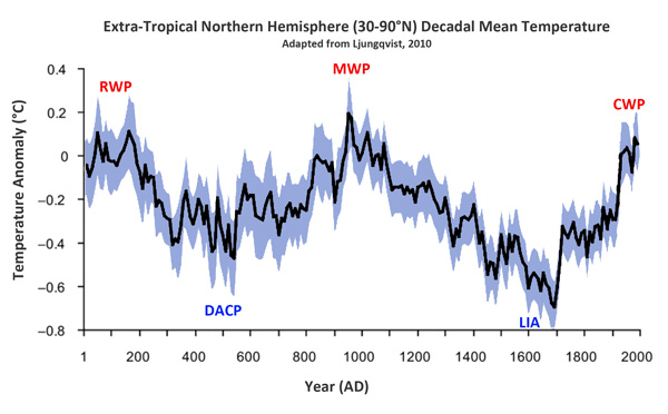
![]()
![]() Temperaturentwicklung der letzten 2000 Jahre auf der außertropischen
Nordhemisphäre
Temperaturentwicklung der letzten 2000 Jahre auf der außertropischen
Nordhemisphäre
RWP = Roman Warm Period
DACP = Dark Ages Cold Period
MWP = Medieval Warm Period
LIA = Little Ice Age
CWP = Modern Warm Period
![]()
![]() Wassertemperaturen der vergangenen 2000 Jahre
Wassertemperaturen der vergangenen 2000 Jahre

↑
j Als das IPCC das Mittelalterliche Klimaoptimum verschwinden ließ
en IPCC changed viewpoint on the MWP in 2001
fr Comme le GIEC avait disparu le Optimum médiéval climatique
![]() de
de
![]() en
en
![]()
MWP = Medieval Warm Period (Mittelalterliche Warmzeit)
LIA = Little Ice Age (Kleine Eiszeit)
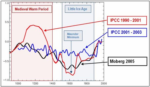
![]()
![]()
The "Hockey stick" curve
Ab 2001 verschwindet dieses geschichtlich belegte Phänomen.
-
Klimaskeptiker Info
2010-03-10 de Als das IPCC das Mittelalterliche Klimaoptimum verschwinden ließ...In älteren Veröffentlichungen des IPCC war das Mittelalterliche Klimaoptimum (Medieval Warm Period, MWP) enthalten.
Ab 2001 verschwindet dieses geschichtlich belegte Phänomen.
Es paßte nicht zu der Behauptung, die Erwärmung des 20. Jahrhunderts sei beispiellos gewesen.
Im Jahr 2001 reflektierte die Darstellung einer MWP die Mehrheitsmeinung innerhalb der Paläoklimatologie.
Das IPCC aber verbreitete ab 2001 einen neuen Standpunkt.
In der Folge erschienen mehrere Studien, die die Nichtexistenz des Mittelalterlichen Klimaoptimums bestätigte.Nach ClimateGate gibt es den Verdacht, daß bestimmte IPCC-verbundene Wissenschaftler wie Phil Jones das Erscheinen bzw. Nicht-Erscheinen von Studien manipuliert haben, um ihren Standpunkt der beispiellosen anthropogenen Erwärmung zu untermauern.
IPCC oder ihm nahestehende Personen haben also die wissenschaftliche Arbeit kontrolliert oder manipuliert.
Fazit: Die IPCC-Berichte haben mit seriöser Wissenschaft nichts zu tun.
Diese Veröffentlichungen sind nichts als bloße politische Propaganda.
-
Hide the decline
2010-03-08 en IPCC changed viewpoint on the MWP in 2001 - did this have effect on scientific results?
-
2006-12-06 en
 "We have to get rid of the Medieval Warm Period!"
Video of Dr David Deming's statement to the U.S. Senate Committee on Environment & Public Works on December 6, 2006.
Dr Deming reveals that in 1995 a leading scientist emailed him saying "We have to get rid of the Medieval Warm Period".
A few years later, Michael Mann and the IPCC did just that by publishing the now throughly discredited hockey stick graph.
⇧ 2018
↑
NOAA-Datenmanipulation um 1,4°C:
"Schlimmer kann Wissenschaft nicht degenerieren"
en
NOAA 2.5 Degrees F Data Tampering -
'Science Doesn't Get Any Worse Than This'
![]()
![]() Man beachte die blauen tatsächlichen Messungen: Kaum Erwärmung.
Man beachte die blauen tatsächlichen Messungen: Kaum Erwärmung.
Dann betrachte man die in rot dargestellten adjustierten Daten:
so sollte ein globaler Erwärmungstrend aussehen.
Ein globaler Fake-Erwärmungstrend, heißt das.
-
EIKE Europäisches Institut für Klima und Energie
James Delingpole / Chris Frey
2018-03-28 de NOAA-Datenmanipulation um 1,4°C: "Schlimmer kann Wissenschaft nicht degenerieren"Die Datenmanipulationen bei der NOAA sind sogar noch viel schlimmer als wir bisher dachten:
Während des vorigen Jahrhunderts wurde die "globale Erwärmung" in den USA um bis zu 1,4°C* übertrieben!Mit anderen Worten, so gut wie die gesamte, von den Torwächtern der weltweit führenden Temperaturaufzeichnungen "gemessene" Erwärmung könnte ein Fake sein.
-
Breitbart James Delingpole
2018-03-21 en Delingpole: NOAA 2.5 Degrees F Data Tampering - 'Science Doesn't Get Any Worse Than This'The data tampering at National Oceanic and Atmospheric Administration (NOAA) is even worse than we thought:
over the last century it has exaggerated "global warming" in the U.S. by as much as 2.5 degrees F.In other words, pretty much the entirety of the 20th century warming in the U.S. "measured" by the world's primary temperature record gatekeeper may be fake.
Quelle / Source:
-
The Deplorable Climate Science Blog / Tony Heller
2018-03-20 en NOAA Data Tampering Approaching 2.5 Degrees FNOAA's US temperature record shows that US was warmest in the 1930's and has generally cooled as CO2 has increased.
This wrecks greenhouse gas theory, so they "adjust" the data to make it look like the US is warming.
Science doesn't get any worse than how NOAA handles US
temperature data.
NASA uses the NOAA data as the basis for their temperature graphs, which have also been massively altered to turn cooling into warming.
⇧ 2017
↑ Temperaturdatenmanipulation von GISS (NASA) erneut nachgewiesen
-
2017-06-09 en
NASA manipuliert Klima-Daten !
-
EIKE Europäisches Institut für Klima und Energie
2017-06-12 de Temperaturdatenmanipulation von GISS (NASA) erneut nachgewiesenManipulation der Temperaturdaten
Seit langem ist bekannt, dass das das zur NASA gehörende Goddard Institute for Space Sciences (GISS) die weltweiten Temperaturdaten manipuliert.
Und zwar fast ausschließlich so, dass heute eine stärkerer Erwärmung erkennbar sein soll.
Zugleich wird auch kein nachvollziehbarer Grund für diese ständige Manipulation angegeben.

Damit sind diese Daten für die Klimawissenschaft wertlos.
Doch selten konnten diese Manipulationen so eindeutig und vor allem so einprägsam und daher auch für Laien überzeugend gezeigt werden, wie in diesem Ausschnitt aus dem Recherche-Video "Schulbuch belegt Schwindel mit Globaler Erwärmung".
↑ en Robust Evidence NOAA Temperature Data Hopelessly Corrupted By Warming Bias, Manipulation
-
NoTricksZone (Pierre L. Gosselin)
Kenneth Richard
2017-01-30 en Robust Evidence NOAA Temperature Data Hopelessly Corrupted By Warming Bias, ManipulationDr. Thomas Karl recently retired as Director of the National Oceanic and Atmospheric Administration (NOAA).
In 1989, Karl's stated position was that global temperatures cooled between 1921 and 1979.
"Analysis of warming since 1881 shows most of the increase in global temperature happened before 1919 - before the more recent sharp rise in the amount of carbon dioxide in the atmosphere, said Thomas Karl of the National Oceanic and Atmospheric Administration's National Climatic Data Center in Asheville, N.C.
While global climate warmed overall since 1881, it actually cooled from 1921 to 1979, Karl said."
Today, not only has the 1921-1979 cooling disappeared from NOAA's official temperature record,
it has been replaced by a +0.45°C warming trend during that nearly 60-year period.
Conclusion
The global temperature dataset available from NOAA suffers from massive and uncorrected warm biases (as preferred by its purveyors), woefully inadequate contemporary measurement coverage, and even worse historical coverage (with inherently non-uniform data collection methodologies).
Consequently, a substantial portion of the temperature data available from NOAA should be regarded as artificial and untrustworthy.
Those who faithfully uphold NOAA's global temperature dataset as "truth" will need to address its demonstrable speciousness - and why they are inclined to believe in it anyway.
⇧ 2015
↑
NOAA in Not: Erwärmungspause der letzten 15 Jahre lässt sich nicht
so einfach wegtricksen
en NOAA erases 'pause' in warming
2015: NOAA Data Tampering Since Last Year
|
|
|
-
Die kalte Sonne (Fritz Vahrenholt & Sebastian Lüning)
2015-12-09 de IPCC-Autor Gerald Meehl verurteilt fragwürdige Rettungsaktionen von Klimaaktivisten zur Erwärmungspause: Der Hiatus ist real und ist erklärungsbedürftig2015-07-02 de NOAA in Not: Erwärmungspause der letzten 15 Jahre lässt sich nicht so einfach wegtricksen
2015-06-15 de Max Planck Gesellschaft: "Die Temperaturen stagnieren ungefähr seit 1998, wenn auch auf hohem Niveau"
-
Watts Up With That? (Antony Watts)
2015-06-09 en Climate scientists criticize government paper (Karl et al. 2015) that erases 'pause' in warmingUntil last week, government data on climate change indicated that the Earth has warmed over the last century, but that the warming slowed dramatically and even stopped at points over the last 17 years.
National Oceanic and Atmospheric Administration has readjusted the data
But a paper released May 28 by researchers at the National Oceanic and Atmospheric Administration has readjusted the data in a way that makes the reduction in warming disappear, indicating a steady increase in temperature instead.
But the study's readjusted data conflict with many other climate measurements, including data taken by satellites, and some climate scientists aren't buying the new claim.
"While I'm sure this latest analysis from NOAA will be regarded as politically useful for the Obama administration, I don't regard it as a particularly useful contribution to our scientific understanding of what is going on," Judith Curry, a climate science professor at Georgia Tech, wrote in a response to the study.
"The new NOAA dataset disagrees with a UK dataset, which is generally regarded as the gold standard for global sea surface temperature datasets," she said.
"The new dataset also disagrees with ARGO buoys and satellite analyses."
-
EIKE Europäisches Institut für Klima und Energie
2016-01-24 de Die "Karlisierung" der Temperatur der Erde
-
Watts Up With That? (Antony Watts)
2016-01-21 en The 'Karlization' of Earth's Temperature
-
Gerald A. Meehl, National Center for Atmospheric Research
2015 en
Decadal climate variability and the early-2000s hiatus
-
Die kalte Sonne (Fritz Vahrenholt & Sebastian Lüning)
Frank Bosse und Fritz Vahrenholt
2016-02-09 de Die Sonne im Januar 2016, Rekorde und Ozeanströmungen: Der Golfstrom bleibt stabil!Das Rekordjahr 2015 und was dazu beitrug
Das Jahr 2015 endete mit einem Rekordwert: Die Temperaturreihe GISS verzeichnete +0,87 °C Anomalie gegenüber dem Referenzzeitraum 1951-1981.
Dies waren nochmals 0,13°C mehr als im Vorjahr 2014 global festgestellt wurde. Besonders stark stiegen die Ozeantemperaturen an.
Ein Blick zurück auf einen nur wenige Monate älteren Datensatz GISS vom Mai 2015 zeigt, dass die globalen Mitteltemperaturen 2014 damals noch um 0,06°C geringer angezeigt wurden als im Januar 2016.
Wie kann das sein? Im Sommer 2015 wurde eine Korrektur der Meerestemperaturen eingeführt, wir hatten u.a. hier darüber berichtet.
Der Auslöser:
Die Messmethoden zur Erfassung der Oberflächentemperaturen der Meere (SST- Sea Surface Temperature) änderten sich ab 1998.Wurden früher die SST von Schiffen aus bestimmt, oft indem die Wassertemperatur in Eimern oder über das angesaugte Kühlwasser gemessen wurde, ging man später zu präziseren Bojenmessungen über.
Dieser Übergang trug, so die Wissenschaftler um T. Karl von der NOAA, eine negative Verfälschung ein, die man mit Korrekturen (für die offensichtlich zu warmen Messungen der Vergangenheit nach unten, für die präzisen Messungen der Gegenwart nach oben) minimierte.
Diese Maßnahme wurde sehr schnell für die globalen Bodentemperatur-Reihen übernommen.
Es gibt hierfür nicht nur Beifall in der Fachwelt, wie unser Artikel "IPCC-Autor Gerald Meehl verurteilt fragwürdige Rettungsaktionen von Klimaaktivisten zur Erwärmungspause: Der Hiatus ist real und ist erklärungsbedürftig" zeigte.
Es erscheint recht fragwürdig, gute neuere Bojenmessungen nach oben zu verändern, um sie an die schlechten alten Eimermessungen anzupassen.
...
NOAA in Not: Erwärmungspause der letzten 15 Jahre lässt sich nicht so
einfach wegtricksen
Update: University of Alabama in Huntsville (UAH) lehnt fragwürdige Veränderungen am RSS-Satelliten-Temperaturdatensatz abEinfluss des El Nino
Einen deutlich höheren Einfluss auf die weltweiten Temperaturen sehen Sie in Abb. 4 im äquatorialen Pazifik: den bereits im November 2015 voll entwickelten ElNino.
Über die Entstehung und den Verlauf dieser internen Variabilität unseres Klimas hatten wir hier berichtet.
Bereits im Jahre 2014 kündigte er sich an, zumindest bis zum Mai.
Ab Anfang August 2014 war er abgesagt, wie wir hier meldeten.
Nun also kam er mit einiger Wucht in 2015 und bescherte den globalen Temperaturen im Jahr 2015 im Mittel einen Anstieg von ca. 0,09 °C.
Das viele rot in Abb. 4 hinterließ seine Spuren in den Troposphären-und Bodentemperaturen.
Alle genannten Beiträge zum Rekord in Summe belaufen sich auf ca. 0,16°C. Nach GISS hätten wir dann etwa die globalen Temperaturen des Vorjahres.
Der Rekord in 2015 ist also zu ganz großen Teilen auf natürliche Variabilität
und eine umstrittene Korrektur von Messdaten größtenteils der Vergangenheit zurückzuführen,
die die Trends ansteigen ließ, gewissermaßen "on top" auf die klimatische Entwicklung.
Im Übrigen zeigen die Satellitenmessungen der Troposphäre keinen Rekordanstieg : beide Messreihen, sowohl UAH als auch RSS, geben 2015 nur als drittwärmstes Jahr seit 1979 an.
Dass die Troposphärentemperaturen langsamer steigen als die Bodentemperaturen ist ein Sachverhalt, den die Klimamodelle nicht reproduzieren. Sie erwarten es genau anders herum.
...
Was erwarten wir von 2016?
Zunächst werden die Temperaturen weiter hoch bleiben.
Die Wärme des ElNino ist noch vorhanden: Sie schlägt sich in verstärkter Wolkenbildung im Ostpazifik nieder. Diese latente Wärme wird erst später in den Weltraum abgestrahlt.
Der ganze Vorgang sollte noch etwa 4-5 Monate dauern,
dann werden die globalen Temperaturen sinken.
Es kündigt sich dann nämlich eine LaNina an. Dies ist nicht etwa das Gegenteil eines ElNino mit seiner Strömungsumkehr.
Vielmehr sind es "verstärkte Normalbedingungen".
Die Passatwinde wehen heftiger als normal und fördern sehr viel kühles Tiefenwasser vor Südamerika an die Oberfläche.
Dadurch wird ein Teil des erwärmten Wassers eines ElNino wieder in die Tiefe vor Indonesien verfrachtet und in die Oberflächentemperaturen geht eine große Kaltwasserfläche im äquatorialen Teil des Pazifiks ein.
In die globalen Temperaturen wird dieser doch recht heftige Umschwung sehr wahrscheinlich erst in 2017 voll durchschlagen.
Für klimatische Einschätzungen wird es so auch in 2017 noch zu früh sein, denn erst nach der zu erwartenden LaNina wird sich ein "neutrales Niveau" einstellen.
Wo das liegt ist noch unbestimmt.
Entwarnung im Atlantik
Erinnern Sie sich noch an die medial so "ausführlich" ausgeschlachteten Meldungen vom Frühjahr 2015, dass sich der Golfstrom dramatisch abgeschwächt hat durch das Schmelzen des Grönlandeises?
Wir hatten uns hier sehr kritisch mit einer Arbeit (Rahmstorf 2015) von Stefan Rahmstorf vom PIK und Kollegen auseinandergesetzt, die den neuerlichen Hype auslöste.
Die Süddeutsche Zeitung beispielsweise vermied das Wort "Katastrophe", zitierte jedoch die Autoren, die ihrer Besorgnis Ausdruck verliehen, dass stark reduzierte Atlantikströme "massive Folgen" für Mensch und Umwelt haben, ergänzten die Forscher.
Die Ökosysteme in den Meeren könnten gestört werden, was die Fischerei und die Lebensgrundlage vieler Menschen entlang der Küsten treffe.
Auch trügen Veränderungen zu einem regionalen Meeresspiegelanstieg etwa in den US-Städten New York und Boston bei.
Zudem seien auch Wetterveränderungen sowohl in Nordamerika als auch in Europa denkbar."
Im Januar 2015 erschien nun eine Arbeit von Parker & Ollier, die die Schlüsse von Rahmstorf2015 entschieden zurückweist.
Wie wir in unserem Artikel damals schon zeigten hatte Rahmstorf 2015 einen Stellvertreter ("Proxy") für die Stärke der AMOC (Atlantic Meridional Overturning Circulation, der Wärmetransport nach Norden) verwendet, der bei näherer Betrachtung offensichtlich Schwierigkeiten mit der Kausalität hatte: er reagierte auf AMOC- Veränderungen bevor diese eintraten.
Die Autoren der widerlegenden Arbeit um Albert Parker von der James Cook- Universität in Townsville, Australien verwendeten einen vertrauenserweckenden Parameter, der auch kürzere Schwankungen der AMOC gut abbildet.
-
EIKE Europäisches Institut für Klima und Energie
Klaus-Eckart Puls
2016-02-17 de Klima-Fakten 2015/16Das Jahr 2015 wurde von den Klima-Alarmisten in bewährtem engen Schulterschluß mit den deutschen(!) Medien zum "wärmsten Jahr aller Zeiten" und zum "endgültigen Klimasignal" hoch gejubelt. Jedoch - die Nachprüfung zeigt:
Es war ein so genannter "Super-El-Nino",
der die Temperatur trieb - wie zuletzt 1998. Eine nahezu verzweifelte Aktion, um nach 18 Jahren der Temperatur-Stagnation eine angeblich anthropogen verursachte Klima-Katastrophen-Hypothese zu retten, anhand eines einzigen Jahres.
Alle anderen Parameter machen auch nicht mit:
Weder die Stürme, noch die Sturmfluten, noch der Meeres-Anstieg!
EIKE Europäisches Institut für Klima und Energie
Quang M. Nguyen, P.E.
2016-02-16 de Wärmer, noch wärmer, am wärmsten - NOAA und NASA erwischt mit der Manipulation der AufzeichnungenFAZIT
Wie so häufig von den Mainstream-Medien seit April 2015 wiederholt, erklärten NOAA und NASA offiziell, dass 2015 heißer als 2014 war, das alte wärmste Jahr der Aufzeichnungen und "versprechen", dass 2016 heißer als 2015 sein könnte!
Jedoch, unleugbare Beweise zeigen, dass die von NOAA und der NASA berechneten durchschnittlichen globalen Temperaturen ungenau, unzuverlässig und nicht mit den Satellitendaten konsistent erscheinen.
1997 war das heißeste Jahr
Laut Daten der NOAA Website, war 1997 wirklich das heißeste Jahr der Aufzeichnung mit 16,9°C (62.45°F).
Die globale Durchschnittstemperatur im Jahr 2015 betrug 14,8°C (58.62°F) oder 2,12K (3.83F) von unter der Temperatur 1997. [... und unter der "Normal" Temperatur von 15°C gemäß PIK u.ä., der Übersetzer]
Nach den Daten der NOAA Website, haben die Parameter wie beispielsweise die Durchschnittstemperatur des 20. Jahrhunderts und der jährlichen Temperaturanomalien, die konstant sein müssten, unterschiedliche Werte in den jährlichen globalen Analysen.
Korrigierte historische Temperaturdaten
NOAA und NASA korrigierten historische Temperaturdaten und stellten Temperaturdaten in Gebieten ohne Temperaturaufzeichnung systematisch her, weit verbreitet und unidirektional zum "kühlen" der Vergangenheit, in dem Versuch, einen steigenden Temperaturtrend zu beweisen.
NOAA und NASAm diskreditieren ihre eigenen Satellitendaten.
NOAA und der NASA haben Anstrengungen unternommen, um ihre eigenen Satellitendaten zu diskreditieren - die im Einklang mit dem Ballon Daten sind - weil eine globale Erwärmung Pause seit 1998 im Widerspruch mit der von NOAA und der NASA bevorzugten Behauptung steht.
NOAA und NASA weigern sich die angeforderten Daten heraus zugeben
NOAA und NASA haben sich geweigert, die durch das US-Repräsentantenhaus für Wissenschaft, Weltraum und Technologie angeforderten Daten und Informationen heraus zugeben.
Es gibt keinen Grund für sie die Daten und Informationen, die öffentlich zugänglich sind, zurückzuhalten, es sei denn, sie haben etwas zu verbergen.
↑ en Black Swan Climate Theory
In this five part video series, Engineering Physicist Michael W. Brakey discusses the corrupt data being provided by the National Oceanic and Atmospheric Association in order to promote the theory of Global Warming.
![]()
![]() "Get Out Of Adjusting Business !
"Get Out Of Adjusting Business !
Grün/Green (local source): Lewiston-Auburn area of Maine
Schwarz/Black (NOAA 2013): Maine's overall state
Blau/Blue (NOAA 2014)
(3° Fahrenheit ≅ 1,5° Celsius)
-
EIKE Europäisches Institut fü Klima und Energie
2015-05-12 de Black Swan Climate Theory
-
NoTricksZone (Pierre L. Gosselin)
2015-05-09 en Energy Physicist Implores NOAA To Return To Credibility "Get Out Of Adjusting Business !
-
NoTricksZone (Pierre L. Gosselin)
2015-06-01 en Bombshell: Comprehensive Analysis Reveals NOAA Wrongfully Applying "Master Algorithm" To Whitewash Temperature History
-
NoTricksZone (Pierre L. Gosselin)
2015-07-07 en NOAA's Data Debacle ... Alterations Ruin 120 Years Of Painstakingly Collected Weather Data (Part 2/2)
↑
NOAA versteckt die Rohdaten hinter einem Viertel-Millionen-Dollar
Schutzwall
en
NOAA demands $262,000 fee for looking at their 'public' data
-
Die kalte Sonne (Fritz Vahrenholt & Sebastian Lüning)
2015-04-17 de Verdacht auf Temperaturdatenmanipulation: NOAA versteckt die Rohdaten hinter einem antklimatischen Viertel-Millionen-Dollar Schutzwall
-
Watts Up With That? (Antony Watts)
2015-03-27 en Outrageous: NOAA demands $262,000 fee for looking at their 'public' data
⇧ 2011
↑
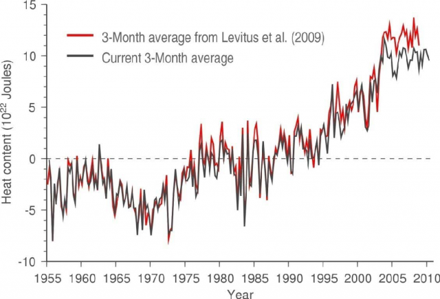
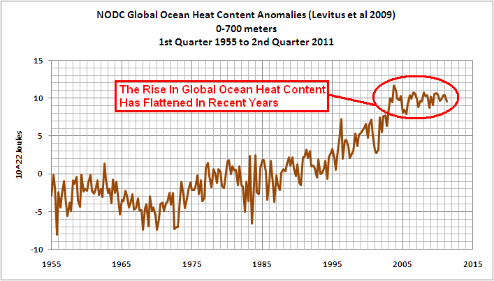
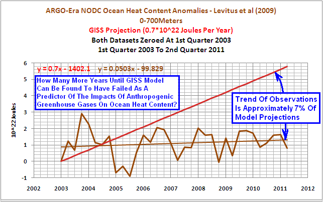
Wärmegehalt der Ozeane ist geringer als bisher gedacht
en
Ocean Heat Content Adjustments: Follow-up and More Missing Heat
![]()
![]()
-
Klimaskeptiker Info
2011-03-20 de Wärmegehalt der Ozeane ist geringer als bisher gedacht
-
Watts Up With That? (Antony Watts)
2011-03-20 en Ocean Heat Content Adjustments: Follow-up and More Missing Heat
Update
![]()
![]()
![]()
![]()
-
Watts Up With That? (Antony Watts)
2011-09-18 en Trenberth's missing heat? Look to the deep